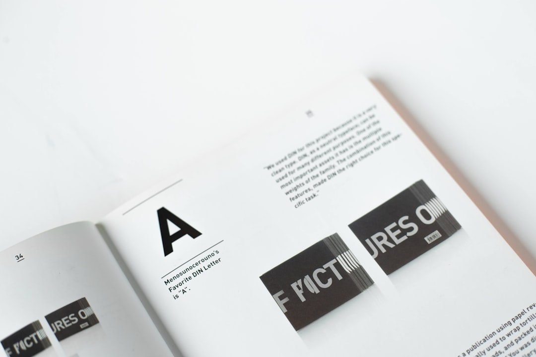
The typeface or font that is chosen for a brand should reflect the values and personality of the brand. For example, a formal and traditional brand may use a serif font, while a modern and innovative brand may use a sans-serif font. The choice of typography can also have a psychological effect on the viewer, for example, a bold and strong font can give the impression of confidence and authority, while a cursive font can evoke feelings of elegance and sophistication.
In addition to selecting the right font, designers must also consider the layout and spacing of the typography. The use of typography can create a visual hierarchy in a design, directing the viewer's attention to the most important elements. The spacing between letters and lines, also known as kerning and leading, can also play a role in creating a cohesive and visually pleasing design.
Furthermore, Typography plays a critical role in the design of logos and wordmarks, which are central to a brand's identity. A well-designed wordmark or logo, that is legible, memorable, and reflective of the brand's identity can be the foundation for a strong brand identity.
In summary, typography is a crucial element of brand identity and plays a vital role in creating a cohesive and visually pleasing design. By understanding the basics of typography, designers can select the right font, create a visual hierarchy, and evoke the desired emotions and tone for a brand. Well-designed typography and usage in the brand elements can create a lasting impact and help to create a memorable and recognizable brand identity.


